Posted by Michael Pinto on Dec 27, 2010 in
Comic Books 
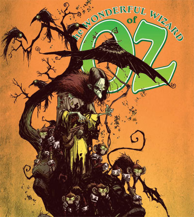
I think one of the more interesting comic book series I’ve been following has been The Wizard of Oz which is illustrated by Skottie Young. This is the cover for the Oz Primer which will be released in March, 2011 by Marvel Comics. I really love how Skottie has liberated his artwork from the 1936 MGM film and reinvented the characters to make them his own.
Tags: Marvel, Skottie Young, Wizard of Oz
Posted by Michael Pinto on Apr 16, 2010 in
Comic Books 
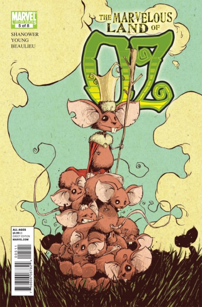
The Marvelous Land of Oz #5 hits the street next week on Wednesday, April 21st — if you haven’t seen this series do yourself a favor and get your hands on it. I love the fact that Marvel is doing a series that doesn’t involve superheroes — and then add the fact that Skottie Young really has a unique visual style that you don’t get to see anywhere else in comics these days. I wouldn’t be too surprised that given the Disney takeover over Marvel that one day we might be lucky and get to see an animated version of this series. Read more…
Tags: Marvel, Skottie Young, Wizard of Oz
Posted by Michael Pinto on Jan 23, 2010 in
Comic Books 
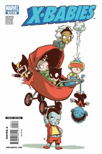
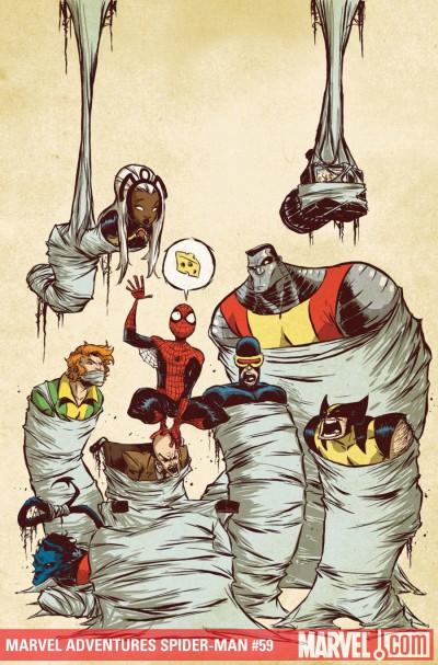
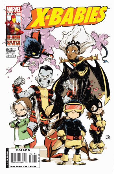
I was reviewing all of the Marvel titles that are set to be released next week and as usual the the one cover artist who always seems to be standing out is Skottie Young. Usually marvel takes itself so seriously so it’s nice to see Skottie injecting his humor and cartoony style into the stiff world of superheroes. At first I would say that Marvel is limiting him to comic books aimed at kids, but frankly these are turning into the best publications that Marvel is producing. Shown above is the cover for X-Babies #4, and below are the covers for The Marvelous Land of Oz #3 and Marvel Adventures Spider-Man #59: Read more…
Tags: Marvel, Skottie Young
Posted by Michael Pinto on Dec 3, 2009 in
Comic Books 
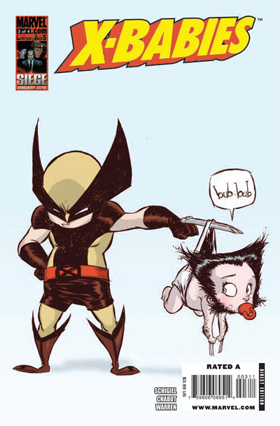
When I first came across X-Babies I have to admit I was drawn in by the ever so cute covers by Skottie Young, but with X-Babies #3 I’m realizing that the best part of the book is actually the interior art by Jacob Chabot. Chabot’s work reminds me a great deal of the chibi style that you see all the time with manga, yet he’s managed to make the style his own and it works very well with the Marvel characters — yet it’s never so cute that you get the Muppet Babies effect: Read more…
Tags: Marvel, Skottie Young, X-Men
Posted by Michael Pinto on Oct 30, 2009 in
Comic Books 
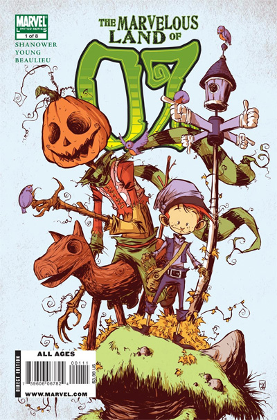
After months of looking at preview art I’m happy to see that The Marvelous Land Of Oz #1 will be hitting comic book shops next Wednesday. It was an act of bravery for Marvel to not only tackle such a well known property — but to bring in illustrator Skottie Young to do it. What I also love is that Marvel isn’t doing the old bait-and-switch where Skottie does an amazing cover and the insides of the book are done by a lesser talent in a hurry. The inside of Oz is 100% Skottie and I like what I’m seeing here: Read more…
Tags: Marvel, Skottie Young, Wizard of Oz
Posted by Michael Pinto on Oct 21, 2009 in
Comic Books 
Shown above is the cover for Marvel Adventures Spider-Man #59 by Skottie Young which is due out in January. I never get tired of looking at Skottie’s work, it always pops out from the pack every time I see the Marvel previews. I like the fact that by taking a cartoony approach with the classic Marvel characters that he’s able to give them some personality that you never see in the more serious action packed and over photoshoped covers you see elsewhere.
Tags: Marvel, Skottie Young
Posted by Michael Pinto on Oct 4, 2009 in
Comic Books 
X-Babies #1 just came out this week and the minute that I spotted the cover by Skottie Young I knew I was in for a treat! The interiors by Jacb Chabot are almost worthy of the golden age of Mad magazine. Marvel is claiming that this title is aimed at kids but I think slightly older fanboys (and fangurls) of all ages will get a kick out of it: Read more…
Tags: Marvel, Skottie Young, X-Men
Posted by Michael Pinto on Jul 21, 2009 in
Comic Books 
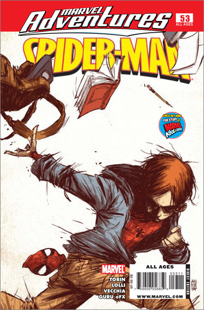
I really love the work that Skottie Young is doing for Marvel these days: In this case his cover illustration for Marvel Adventures Spider-man #53 does a wonderful job of reinventing Peter Parker. Usually Peter is seen as the archetype of the geek who was playing with his science lab routine too much — here he’s reinvented as a punky juvenile delinquent, yet Young has kept true to the larger theme of superheroes with a secret identity. Read more…
Tags: Marvel, Skottie Young, Spiderman
Posted by Michael Pinto on Jun 16, 2009 in
Comic Books 
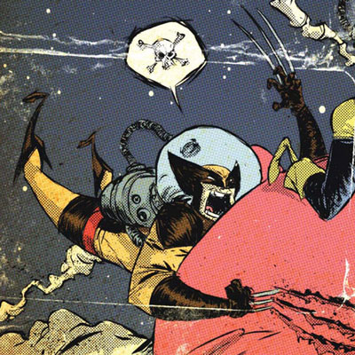
I love Skottie Young’s work, but I’ve been wondering just when Marvel would allow him to take a pass at one of their more well known characters and it looks like for Wolverine First Class #19 they’ve let him run with the ball. The first thing I love about this cover is that it has a sense of humor, too often Marvel covers (or DC) take themselves too seriously. Yet you get right away who Wolverine is despite Young’s cartoony approach. In addition to the usual great draftsmanship and page layout the coloring here is A+: The added zip-a-tone as a texture is nice homage to comics books of the past: Read more…
Tags: Marvel, Skottie Young, Wolverine
Posted by Michael Pinto on May 20, 2009 in
Comic Books 
I was looking through the latest stack of Marvel covers due out in August and one artist leaped off my screen time-and-time again: Skottie Young! Most of the Marvel covers have that flat photoshopped color look to them, but with Skottie I love how the power of his drawing comes out to dominate the page. Also Skottie isn’t afraid to be cartoony, and his illustrations always have a small amount of humor that brings the characters to life without the need to show them in some super stretched position or battling to the death with some super villain. Shown above is a detail from the cover of Iron Man & The Armor Wars #1 (Of 4) — what’s great about this cover is that it’s a homage to every previous Iron Man character design: Read more…
Tags: Marvel, Skottie Young
Posted by Michael Pinto on Apr 5, 2009 in
Comic Books 
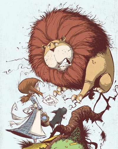
Marvel has has released a series of comics based upon classic books which have been unimpressive on every level, but a wonderful exception to this has been the The Wonderful Wizard of Oz which features illustrations by Skottie Young. It’s hard to reinvent the universe of Oz because the visual style of the story has been so defined by the 1939 film — but Young manages to reinvent this world while staying true to the story. Issue #5 in the series comes out this Wednesday, above is a detail of the cover art and it just looks great. I also love the powerful palette of colors by Jean-Francois Beaulieu who brings Skottie’s drawings to life. Below is another wonderful panel: Read more…
Tags: Marvel, Skottie Young, Wizard of Oz
Posted by Michael Pinto on Oct 24, 2008 in
Comic Books 
In January 2009 Marvel will be putting out the second issue of The Wonderful Wizard of Oz which features cover art and pencils by one of my favorite artists Skottie Young. One of the nice things that Skottie did with this cover is that he’s reinvented the visual look for Oz which has such a well known history – by ignoring the books and the famous MGM film he’s given the title a fresh start. It’s also great just how cartoony this cover looks too, which is something that you don’t associate with typical Marvel comics which seem so obsessed with Photoshopped realism. Speaking of Photoshop notice how good the coloring is? Young has a very washed out water-colored looking palette instead of the over saturated primary tones you see too often today. And all of this is just the background to the character designs which have a wonderful whimsy to them. Read more…
Tags: Comic Books, Marvel, Skottie Young, Wizard of Oz


