Posted by Ben Huber on Jun 2, 2013 in
Design,
Videogames 
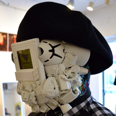
Watch out Daft Punk, your rusty, built-from-scrap arch-nemesis is here, and he’s made from GameBoy parts. THUNDERBOX had a cool art show going on and one of the standout pieces was a life-size and wearable mask made from a GameBoy and other electronics. Along with that there was also a GameBoy-inspired jacket, in which you are the cartridge. The whole combination of fashion and gaming typically isn’t too “savvy,” but THUNDERBOX has some really fantastic and creative stuff, so take a look at more images below of the show, and then visit their site to get some THUNDERBOX in your life. Read more…
Tags: Art Gallery, Design, Fashion, GameBoy
Posted by Ben Huber on Aug 27, 2012 in
Television 
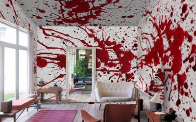
Ok, maybe you wouldn’t want to look at this wallpaper all the time, but next time you get to remodel, wouldn’t you want to throw it in the pile just to see your significant other’s reaction? It’s bloody wallpaper – what’s the worst that could happen? Explain it away easily: you slipped and cut your finger open. Really badly! Or maybe your dog got into the jam. And… threw it on the ceiling! It’s easy, see? Better yet, secretly install the wallpaper in your basement and wait to see how people react. Even better: install it in someone else’s basement! Endless laughs! Until you get in trouble for trespassing. Buy it here, on PIXERS online store. Read more…
Tags: Design, wallpaper
Posted by Ben Huber on Aug 6, 2012 in
Design 
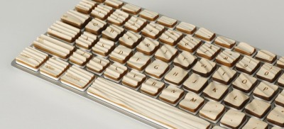
Sometimes I see something both cool and bizarre – this is one of them. We seems to distance natural materials from our technology and gadgets (maybe all that wood panelling on our old cars turned us off from that for a long while) but this sandblasted wood grain overlaid on keyboard keys makes a lot of sense. Designed by Michael Roopenian, the tactile nature of it allows your fingers to more easily find the keys you’re looking for as you learn the layout. Although it’s just a prototype at this point, I’d love to see it become a real product someday. Read more…
Tags: Design, Prototype
Posted by Ben Huber on Jan 6, 2012 in
Videogames 
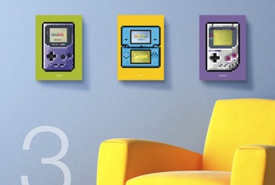
A little bit of pop-art never hurt anyone, especially not these great-looking prints from BiscottoCotto, featuring tons of different systems, from the Dreamcast to the Gameboy. These look like great additions for an arcade room or any place you’re trying to brighten up a bit. They allow for some customization as well, so you can pick your background color if you wish. They’re going for $15 for a single print on BiscottoCotto’s Etsy page. Read more…
Tags: Design, GameBoy, Prints
Posted by Ben Huber on Jan 1, 2012 in
Fandom,
Star Wars 
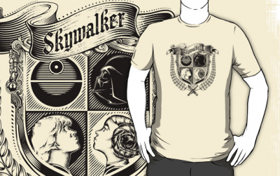
Looking for another quirky t-shirt for your already large collection? 6amCrisis brings us an excellent Star Wars shirt with a great coat of arms design featuring the most important members of the Skywalker family. Some might ask where Padme is – to them I respond: who? Ok, joking aside, this is a pretty great shirt, and a nice plus is you can choose which color you prefer. You can also get it as an iPhone case or baby’s clothing (huh?). Check his redbubble profile for more awesome work! Read more…
Tags: Design, T-Shirts
Posted by Ben Huber on Dec 4, 2011 in
Videogames 
Being the Legend of Zelda fan that I am, I’d be remiss to not bring your attention to a quirky and cute print by Andrew Kolb, The Hyrulean Book of Biology. Throughout all the many Zelda games one of the highlights has been all the cool, silly, and creative creatures you come across in your adventures. And in case you were wondering: yes, this colorful print is of course also a reference to Charley Harper’s cover for The Giant Golden Book of Biology. The only thing that could make this print better is if it really were a complete book – but that’s asking a bit much, I suppose. For now though, this poster will do nicely. If you’re like me and are thinking about picking one up for yourself, check out Andrew’s site for the Hyrulean Book of Biology and other posters.
Tags: Design, Legend of Zelda, Poster
Posted by Ben Huber on Dec 4, 2011 in
Star Wars 
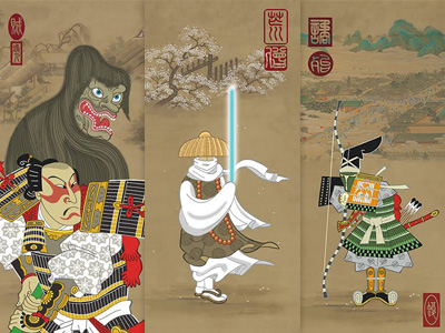
Have you ever wanted some art to spiff up your geek abode? Finding excellent art prints of your favorite movie or book isn’t hard these days, but every once in a while you catch a glimpse of something truly special. Case in point: Steve Bialik’s delightful Samurai Star Wars prints. These six 11″ x 27″ prints feature several popular Star Wars characters reinterpreted in the style of traditional Japanese art. It’s quite an interesting circle, given the inspiration Star Wars took from Japanese history (something that was probably the basis for these prints). One thing I must note is the fantastic use of color in these – I particularly like the “Emperor” and “Jabba the Hutt” prints, they’re really eye-catching. These would make great pieces for any fan’s home, so if you’re interested in any of these, be sure to check out Steve’s site where he has them available for purchase. Read more…
Tags: Design, Japan, Poster, samurai
Posted by Tim Sheehy on Oct 4, 2011 in
Design,
Fandom 
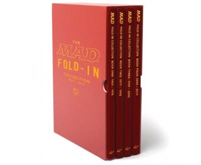
A few months back, Chronicle Books published The MAD Fold-In Collection: 1964-2010, a collection of Al Jaffee’s award-winning fold-ins featured on the back of MAD Magazine over the past four decades. For those of us who grew up reading MAD, this special collection is an absolute must-buy. Though I haven’t personally subscribed to the publication in recent years, I have fond memories of purchasing issues and immediately flipping them over to see what Jaffee had in store for us. His brilliant designs are not only humorous and satirical, but constantly remain topical and are often thought-provoking.
Read more…
Tags: Design, Mad magazine
Posted by Michael Pinto on Nov 2, 2008 in
Design 
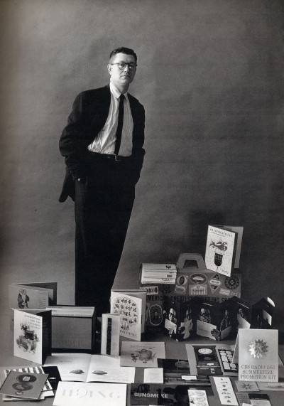
About a week ago I was very saddened to hear about the passing away of Lou Dorfsman. While Lou didn’t design the famous CBS eye (that was William Golden) from the 60s until the 80s he put the tiffany in the tiffany network. The CBS of today is but a shadow of what it was during that era, but back then it was one of three corporations that dominated American media and Lou gave them their signature look.
In my last year of art school my father purchased a copy of the book Dorfsman & CBS for me which showcased the entire career of Lou Dorfsman and it inspires me to this day. The first thing that you’ll notice is that most of what Lou does is in fact print design, and while he did do his share of animated titles and set designs it’s the medium at which he excelled. What I love about his work is that it’s not just about pretty pictures, but about using words and typography in clever ways to communicate his message. The other thing to keep in mind that as a creative director Lou was a manager, so what you’re seeing here is the word of many other talented people including typographers, photographers, illustrators and even printers.

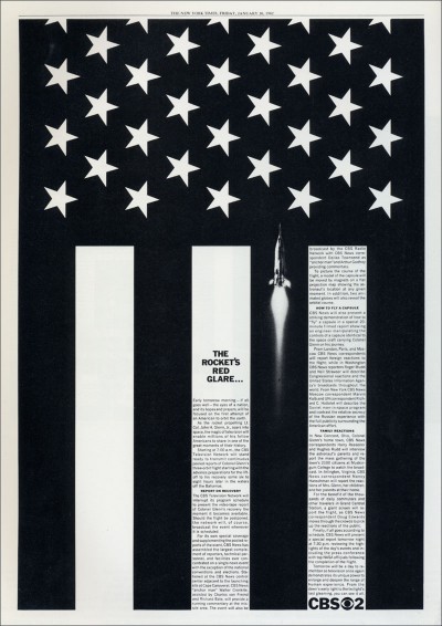
The first time I viewed this ad was in a course on the history of graphic design, and I was blown away! It’s a newspaper ad from 1962 showcasing the CBS News coverage of the John Glenn space flight. What makes it brilliant is that Dorfsman has taken the graphic convention of the american flag and by turning it 90 degrees and adding a rocket made it represent the hopes and aspirations of the space program. Simply put this is conceptual graphic design at its best.
Read more…
Tags: 1951, 1955, 1962, 1963, 1968, Al Hirschfeld, CBS, Design, John Glenn, Lou Dorfsman, Red Skelton


