Captain I’m Afraid This Retro Star Trek Lunchbox is Inauthentic

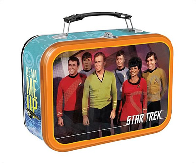
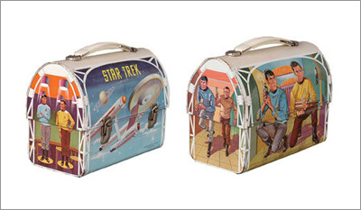
You can now pre-order the Star Trek Original Series Lunch Box — but frankly the design of this schlocked out trinket misses the point in my book. For starters the side of the lunchbox misses the spirit of the entire show, the typography and graphic symbols have nothing to do with the late 60s. But the biggest missing part is that a lunchbox from that era wasn’t always photographic — in fact for a science fiction show you’d expect to see an illustration. And this I present to you the real deal, an authentic Star Trek lunchbox from the 60s:

Firstly the box is all about Kirk and Spock, and they’re armed to the teeth! Next notice how the Enterprise itself is the star on the other side of the lunchbox? And it’s not just hanging out there in space, but it seems to be in low orbit around a planet with one very strange moon that has multiple rings around it. Now did Kirk ever wear brown pants in the entire series? Hell no! But that’s not the point — what’s important is that the lunchbox is an art form onto its own.
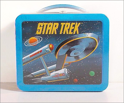
Sadly over time this art form died out as kids in the 70s started brown bagging their lunches. This later day Star Trek lunchbox from that later era features a badly painted enterprise lacking in detail and perspective:

And alas sadly by the late 70s illustrations (and imagination) had all but disappeared from the lunchbox. Frankly I’d blame it all on Star Wars, but if I’m honest Space:1999 started the trend. Beam me up…


