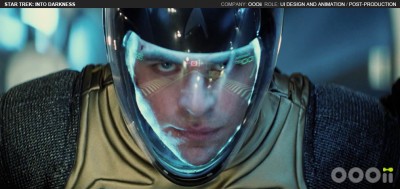
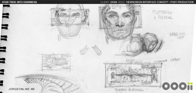
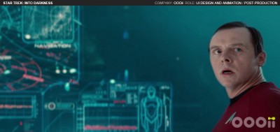
See How the UI of Star Trek Into Darkness Was Made
I love behind-the-scenes articles and seeing how things were made for the movies we enjoy, so this great interview by Inventing Interactive with Jorge Almeida about the UI design process in Star Trek Into Darkness is right up my alley. Jorge goes into detail about how he and his team worked on the UI and graphics that the Enterprise crew would be interacting with. My favorite bit it when they talk about the space jump sequence, and the heads-up display used there. If you love those kinds of details this is a fun read. Check out some more concepts below and read the interview here.


