Ten Creative Covers from Japan
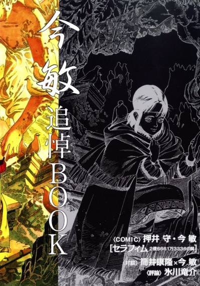
As an art director I’m jealous of Japan because their publishing industry really uses a great deal of creative illustration while too many American book covers are the result of stock photography. While there are exceptions to the rules when ever I walk into a Japanese bookstore I’m always struck by the fact that almost every other book has a high quality illustration. For this article I’ve collected ten cover illustrations that caught my eye. Shown above is a Satoshi Kon Memorial Book — I really love the contrast of the black and white drawing with the column of color on the left of the page.
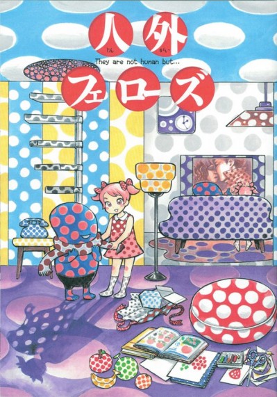
Fellows Felon
The use of dots as a texture in this illustration is wonderful — it’s like a cross between the the bugs Bunny cartoon Hair Tonic and the Memphis furniture design from the 80s.
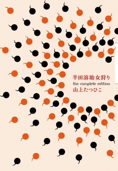
Hunting Woman Handa 溶助 The Complete Edition
I love how these cartoony sperm are cute yet minimal — the result is an very nice graphic illustration.
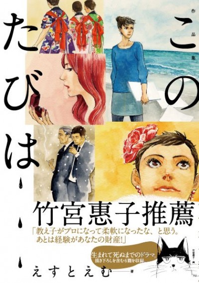
This Time the Works
This cover is very “slice of life” yet it makes all of these mundane moments rather entertaining through the use of color. I really love the touch of the black and white cat illustration on the bottom right of the page as well.
Spirits meets PARCO
This is a bit of a cheat as it’s really a poster and not a publication cover. I love the strong use of negative space with the powerful pink background and the large cast of characters in the lower right corner of the page.
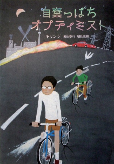
自棄Ppachi Optimist
This is a book cover — what makes it nice is how the artist uses the dark gray background to really pop up the characters in color. The typography reminds me of a neon sign which is also a nice little touch.
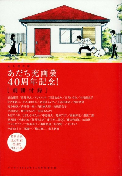
A Magazine Advertorial Celebrating the 40th anniversary of Mitsuru Adachi Paints
The bold use of red here is just wonderful! I like how the minimalism of the illustration is picked up by the red below.
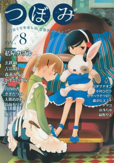
Bud Vol.8
Most maid themed covers are glamorous — yet here we see someone tending to a child’s shoe strings. I love how the child looks slightly haughty yet her big bunny shows a bit of insecurity. There’s something very Cinderella like about our maid as well as she seems to be in a lower station of life rather than being the center of attention.
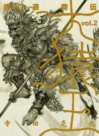
Journey to the West Monkey King Tsutae Hiroshi Odd, Volume 2
The level of detail in this monkey is wonderful — I also love the fact that the illustration is a drawing and not colored in at all.
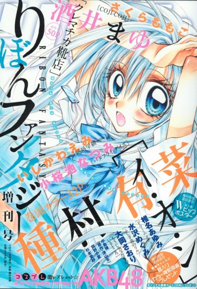
Ribbon Fantasy Special Edition
This last cover that I picked is perhaps the most typical of what people think of as “anime” or “manga”. What’s nice about this illustration is the level of both chaos and order in the drawing. The color scheme of aqua blue, white and just a bit of hot pastel pink and orange makes you feel like you in the middle of a magical wave. The added touch of having the typography at an angle nicely compliments the drawing on the page.


