Please Toei: Don’t Turn Captain Harlock into Howard Stern
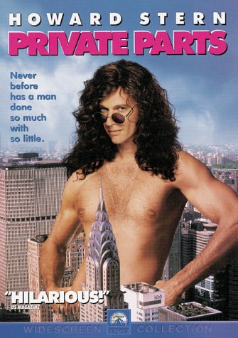
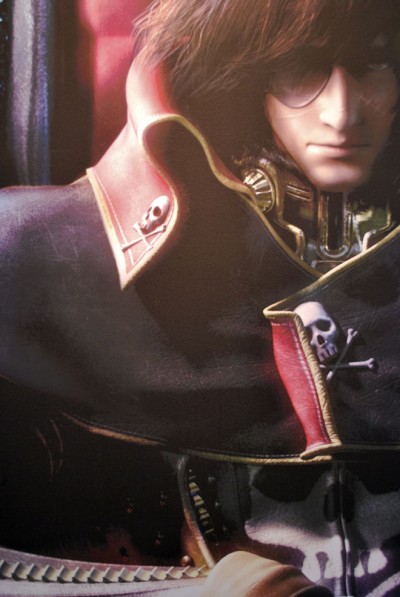
 I was filled with horror looking at the above sneak peak poster from the Captain Harlock computer graphics film that Toei has planned for 2012. Clearly Toei has learned little from the horrible AstroBoy film that came out last year. I’ve some some amazing anime that’s been done in 3D, but very rarely have I seen a studio be able to pull off translating a 2D character into 3D. The first problem I noticed with this harlock poster is that while the clothing is just right, there’s something not quite working about the face and the hair. The result is that Harlock starts to look like Howard Stern with too much makeup on:
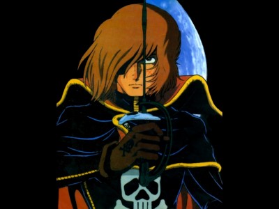
If you look at the Matsumoto character design from the early 80s you’ll start to notice the real differences. Firstly Harlock’s face isn’t as thin as the computer graphics poster — his chin is more pronounced and less effeminate. And next you have his nose which doesn’t have a curve and is a bit more lean looking. I also think that the level of detail in the hair takes away from the face. A way they could have fixed that would be to give his skin just a bit more texture. The result of the smooth skin with the overly detail hair is that the captain looks a bit too much like a Barbie doll.
And then lastly you have the clothing: Harlock always wears ultratight everything, yet in the computer graphics poster he seems to be buried under a pile of clothing. There are all little details, but when you add them all up the soul of the character design is missing.


