So Why Does a Badass Like Black Jack Look so Damn Cartoony?
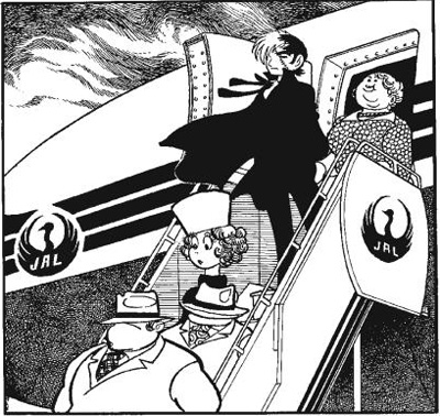
Not so long ago I had a friend who’s a modern anime fan hunker down with a copy of the now vintage manga Black Jack, and to make a long story short he couldn’t quite grok the cartoony style of early 70s Tezuka. In fact to him the cartoony style look dated which spilled over into a twitter debate with Ed Chavez of Vertical which re-published the manga. As I have an art school background I’d thought I’d try to explain this via a little art history lesson so that we can put Black Jack (which got started in 1973) into perspective:
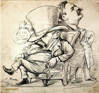
The term cartoon actually comes from the Italian Renaissance and in fact refers to a drawing an artist would make before doing their real painting. And as time progressed with the dawn of printing cartoons became an art form onto their own, and many of those early cartoons were political or social satire. These cartoons were usually several panels at the most and could be quite detailed in nature and very realistic given the limitations of the medium. Shown above is a Thomas Nast political cartoon from about 1888. Now when you’re looking at this keep in mind that Nast didn’t have to draw multiple panels of these cartoons so he had the luxury of getting very detailed.
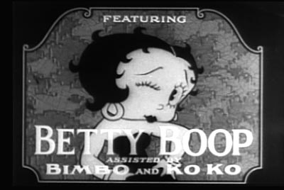
What you’re looking at here is a still from a black and white Betty Boop cartoon an animated series that first appeared in the early 1930s. Animation predates this by a few years, but if you look at all of these early cartoons you’ll notice that they’re very cartoony and much more simplistic in design than modern animation. This was a practical result of the sheer amount of work required to create animation: Film plays at 24 frames per second and animation is done at two frames per drawing, this means that it takes 12 drawings to create just one second of animation. That means that a full minute on the screen requires 720 drawings! It’s because of this that early animation had a very geometrical streamlined look to it. If a character design was too complex you just couldn’t animate it…
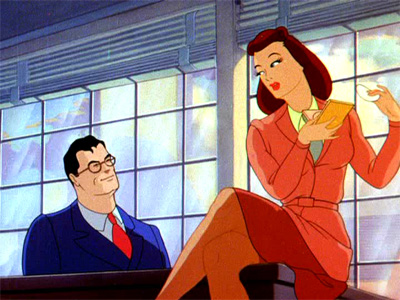
Comic books are closer to film than political cartoons as you have to draw the same character in multiple frames week after week in multiple panels. However coming from a printed medium comic books could afford to be more detailed by nature. Of course as animation matured the character designs started to get more complex — in fact by the 40s they got quite sophisticated.
Shown above is an example of a Superman cartoon by Max Fleischer from that era. Now notice that the skin tone on Louis Lane and Superman are in two tones, this approach would later impact anime in a big way. By the way this Superman cartoon is very unlike Disney from the same era which had a much more cartoony look even in Fantasia.
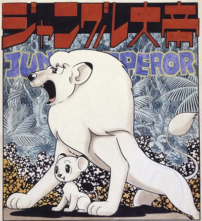
Dr. Osamu Tezuka got his first real start drawings comics after World War II, so he’s coming of age in a world where cartoons look very cartoony. It’s important to note that the look of animation started to rub off on comic books. A good example of this would be Peanuts by Charles Schulz. It’s also important to note that during this era modernism and abstract art is becoming very popular and that rubs off onto cartoons of that era which are also trying to look more modern and streamlined.
Shown above is a drawing of Jungle Emperor (ジャングル大帝) which was created by Tezuka in 1950 as a manga, of course Americans know this character as Kimba the White Lion which became an anime series in the 60s. Looking at these two lions you’ll notice that while they’re cartoony they’re very streamlined in appearance — you’ll also notice that the large eyes owe quite a bit to the Betty Boop character design from twenty years before. Although our lion is quite a few leaps ahead of the first Betty Boop cartoons from the 30s in terms of complexity.
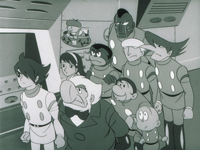
This is a still from the science fiction anime series Cyborg 009 from 1968, and the first thing that you’ll notice is that it’s in fact very cartoony. Granted that these are character designs of humans, but they’re even less realistic than Superman from the 40s. Now part of this is a budget limitation as this animated series didn’t have the luxury of creating detailed drawings, although part of look of the show is what was fashionable in the era.
Editor’s Note: It’s important to point that the character design for Pyunma (ピュンマ) is quite racist and sadly the Japanese here picked up on that sad iconography from American culture from that era.
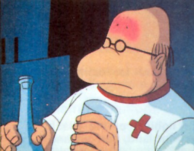
Dr. Sakezo Sado
So I bet your thinking: But what about the need to keep the designs simple so they could be animated? Well the answer is that these cartoons used a great deal of what’s known as “limited animation”. These are techniques that you see in the Flintstones where a character will be still and only their mouth will move on the screen. And of course many of these shows would use “slide the cel techniques” to push a spaceship or robot across the screen without the need to create multiple drawings.
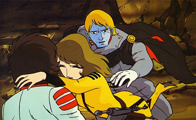
However Tezuka was drawing Black Jack a bit before this era, so his work is much more cartoony. The still above is from the film Arrivederci Yamato from 1978 which in its era looked revolutionary. Although it’s not too far away from what Tezuka is doing during this same time frame. In fact if you look at the character of Dr. Sakezo Sado from Yamato you’ll notice that he’s very cartoony because he’s used for comic gags through out the show.
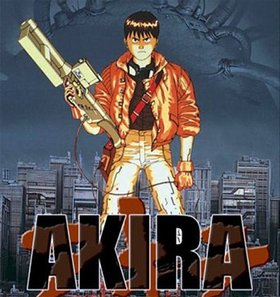
Akira which came out in 1988 had a much darker more serious look to it from what anime looked like just ten years before in the 70s. And this was more of an evolutionary process where each anime series that came out during the 80s would keep improving production techniques while making the character designs more sophisticated in the process. Although if you look at the hair on this character design you’ll see that it owes something to Tezuka.
Now sadly Tezuka passed away by 1989, although his style didn’t stay stuck in the 60s. It was still cartoony in the 80s, but if you look at Black Jack by he end of his run he looks a bit different than when he started. Also while Tezuka is drawing comics up until the end of his life, at heart he’s very much an animator which makes him quite unique in terms of the style of his drawings.
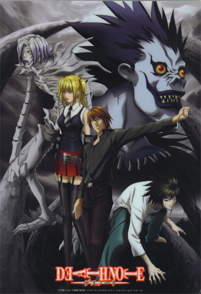
So this is Death Note — and when otaku of our era think of anime this is the image that they usually have in their minds. But you want to know something? Without Tezuka taking the first baby steps with Black Jack what you see above wouldn’t exist at all. It’s that dark side of Black Jack that started the ball rolling. Of course Tezuka had peers like Go Nagai who started drawing Devilman at about the same time:
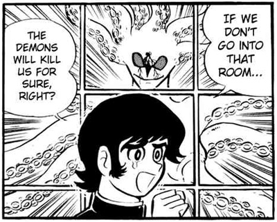
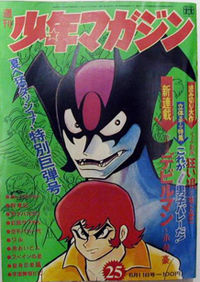
Devilman in 1972
Now notice how very cartoony Devilman is! In fact if you look though the original manga it reminds you a great deal of Tezuka in terms of style. Although Go Nagai goes to a much darker corner of the universe than Dr. Tezuka. But without both of them anime wouldn’t look and feel like it does today without the ground that they were breaking back then in he 70s.
So when you’re looking at Black Jack it’s the same thing as listening to a Beatles track to a certain degree — you need to take it within the context of the era that it was produced. When the Beatles did what they did punk wouldn’t happen until just a few years later (and rap and disco too!). So you need to think of Tezuka in a context of a time when old school Disney ruled the world of animation and when the silver age of American comics was going on in the United States.
So when you’re reading Tezuka from the early 70s give yourself the room to think of the era that he created that manga and you may even find yourself appreciating not just his writing but the style of the artwork itself which is wonderful. Also give yourself the freedom for a manga to not have to look so slick and polished, there’s something very raw and wonderful on those pages which can be appreciated if you look there.


