Spock Reflects: Is This the Worst Comic Book of 2009?

 Star Trek: Spock: Reflections #3 looks more like a bad coloring book than a real comic book. Now I’d love to blame the artists, but my bet is that they’re underpaid. I’d love to blame the writers, but my guess is that they’re given too little time and told “what ever”. I’d love to blame the publisher IDW, but then my guess is that they felt like they needed to cut corners because they paid too much for a license that’s seen as a cash cow. The fault that Star Trek: Spock: Reflections #3 looks so bad is because Paramount doesn’t give a damn about Star Trek.
By “give a damn” I don’t mean the bottom line as I’m sure they know what it takes to keep the investors happy. What I do mean is to give a damn about quality — which translates into hooking the next generation of fanboys and fangurls onto your franchise. This is what George Lucas does so well: He knows that if every little trinket doesn’t look amazing that kids will look elsewhere for their entertainment. And that’s why every Star Wars comic book looks amazing, the covers are so good that an adult could hang one up on a wall as a poster and not feel stupid about it.
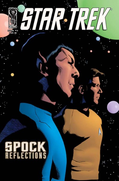
This cover art looks like a bad fanzine from 1975, except that a bad fanzine from 1975 wouldn’t have just traced over a photo.
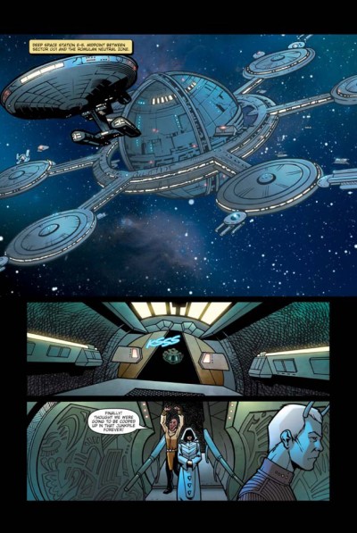
Look at any Japanese manga where they have to draw a spaceship — they always make it look amazing! This looks like a doodle in the corner of a student’s notebook. And that crosshatching in the middle panel looks terrible.
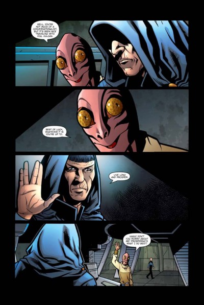
And next we have, umm WTF??? Is it me or is that alien character lifted from Star Wars?! He just looks so damn lame that any respect you may have had for the story just went out he window at this point.
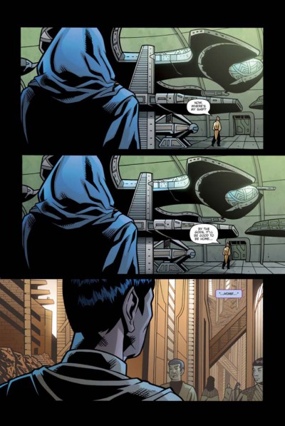
Now, where’s my ship? Maybe it’s in one of those two giant panels that you just wasted two thirds of the page on…
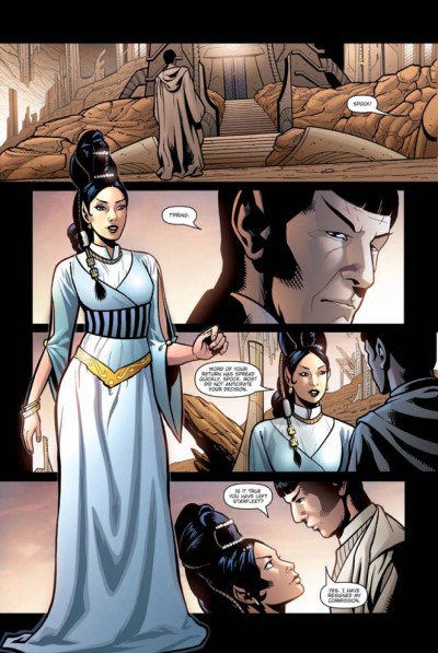
T’Pring does not look sexy enough here! If you recall the original series T’Pring was suppose to be so damn hot (and she was in the TV show) that even logical Mr. Spock would through out EVERYTHING to be with here. Here she looks like a Vulcan Barbie Doll! By the way here’s a chance to attract future fangurls to the franchise — yet the rendering of the clothing pays no attention to detail (you can’t even see her shoes).
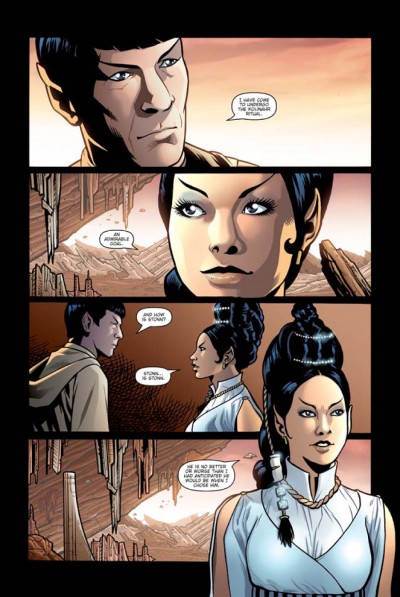
You’ve got some great drawing of stalactites and stalagmites here, but the cropping on each panel of the page looks weak and awkward. It’s like the artists were so worried about tracing the photos that they can’t quite get the layout to work well. Maybe that’s a result of trying to be too slavish to the history of the show, but the result is a stiff page that doesn’t hook you in.
Now did Paramount sign off on any of this? I doubt it! But that’s the problem — a comic book is a chance to speak to your audience and keep their loyalty. It’s not a t-shirt with a logo but an extension of the show. By the way for the record here is a screenshot of T’Pring from that classic episode Amok Time, doesn’t she look a thousand times better than what you see in this comic book?


