Dear Marvel Comics: Please Stop It With the Bad Photoshop Filters

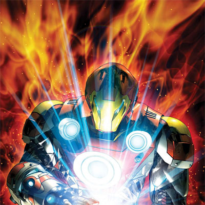
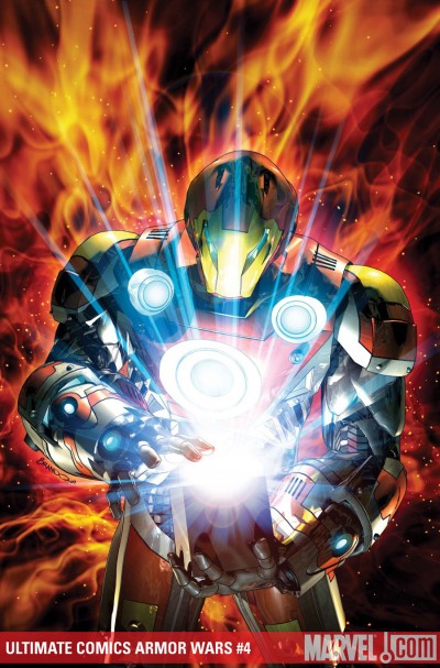
Photoshop is an amazing tool, but in the wrong hands it can be a disaster! The first beginner mistake that most kids make with Photoshop is to use every damn filter that there is like gleams-and-glows and goofy texture maps of fire effects. This is not too dissimilar to the graphic design mistake of using too many typefaces when just one will do. I’ve got to say the quality of covers for Marvel Comics Entertainment is a pretty mixed bag: Sometimes the cover look great, but other times they cover illustrations look amateurish. And Ultimate Comics Armor Wars #4 is just screaming to me that Brandon Peterson needs to lay off the lens flare just a little bit:
The problem with this cover is that at some point it stopped looking like a comic book and started looking like a parody screen shot from a special effects film. Of course in a good special effects film you don’t notice what is a special effect, in a bad special effects film the gimmick of moment is put on parade.
The problem with this cover is that between the lens flare and the stock photo fire that you never see poor old Iron Man in he middle. Frankly if this was the year 1999 that cover would look amazing, but in the year 2009 any child using Photoshop could do the same thing.


