My Aspirational Amazon Kindle 2

The first Amazon Kindle looked like something from the 90s, you’d half expected that it would be running HyperCard with some Voyager CD-ROMs providing the content. So with the debut of the Amazon Kindle 2 I was sort of surprised to see them still sticking with the same old ugly plastic buttons, a black and white screen and that awful off white casing surrounding the display. Frankly in a recession I’m not going to drop $360 on something that looks like it should cost under $100.
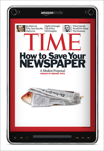
So I started thinking about what I would have liked to have seen in this latest version; For starters a touch screen is the way to go if most of what you’re doing is reading on the device — giving up one inch for a physical interface sacrifices valuable screen real estate. This isn’t to say that I wouldn’t mind a few basic buttons or something unique and new like a slider mechanism, but that sort of thing needs to be kept at a minimal.

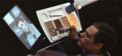
Next I started thinking about 2001: A Space Odyssey where they had flat panel portable TVs — to me this means that the display would need to be in color and to make the experience complete some decent speakers would help. Looking at Kubrick’s handy work I think once you create this sort of device content providers will focus on it as a new medium instead of repurposing existing printed publications (which was the vision of folks like Bob Stein from Voyager in the early 90s).
Note: If anyone would like to reuse my quick mockup please go ahead, all that I ask is that you give credit for the illustration and link back to this blog.


